How to Write an Effective Annual Impact Report for a Nonprofit
If you work in the nonprofit or social-impact space, you know the annual impact report is more than just a year-end summary. It’s your organization’s story of change — a tool to build trust with donors, inspire volunteers, and hold yourself accountable to the communities you serve. But writing one that actually lands with your audience takes strategy, clarity, and a thoughtful approach to data.
Whether you’re drafting your first report or revamping an existing one, here’s a practical guide to creating an annual impact report that moves hearts and keeps you top of mind.
What Does a Good Annual Impact Report Look Like?
A strong impact report is part narrative, part evidence. It answers the question: “How did we make an impact this year?” But it does so in a way that feels human, not like a list of stats and facts.
A good annual impact report is:
Reader-focused. It understands that your audience (donors, board members, partners) is busy. Lead with your most compelling impact story, not your organizational history.
Visual and scannable. Use headings, pull quotes, testimonials, and data visualizations to break up text. Readers should be able to glance at a page and grasp the big picture.
Honest. Celebrating wins is important, but acknowledging challenges and lessons learned builds credibility.
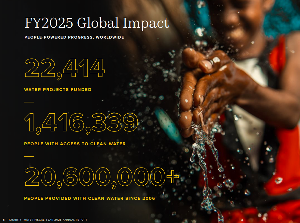
Charity: Water does a great job at making important statistics clear, paired with moving imagery.
What Are the Key Sections of a Comprehensive Impact Report?
While every nonprofit is different, most effective reports follow a similar structure. Here are the sections I recommend:
1. Letter from Leadership
A personal, signed note from your executive director or board chair. Use it to set the tone, thank supporters, and highlight one or two transformative moments from the year.
2. Mission & Vision Snapshot
A brief reminder of what problem your organization is solving. Keep this short. A sentence or two plus a powerful image or tagline makes the case.
3. Program & Impact Highlights
This is the heart of the report. For each major program or initiative, include:
A short narrative (what happened, who was impacted, what changed)
Key statistics (number of people served, hours of service delivered, etc.)
A real story or testimonial that illustrates the human side of the numbers. Where did these funds go? Show them and keep it transparent.
4. The Numbers: Metrics That Matter
A dedicated section for the data. We’ll talk about which metrics to include in a moment.
5. Financial Summary
A clear, honest look at your revenue and expenses. An easy-to-read pie chart or table is fine — just make sure every major ratio (e.g., program spending percentage) is labeled so readers don’t have to guess what things mean.
6. Donor & Partner Recognition
Thank your supporters! Depending on space, you can list names, create a donor wall, or spotlight a few key partners. This section builds goodwill and encourages ongoing giving.
7. Looking Ahead
Share one or two goals for the coming year. This turns the report into a forward-looking conversation, not just a recap for the past year.
What Key Metrics Should Be Included in an Annual Impact Report for a Nonprofit?
Choose metrics that show both outputs and outcomes. Outputs are easy to count (e.g., “2,000 meals delivered”) but outcomes tell the deeper story (e.g., “85% of clients reported improved food security after three months”).
Recommended metrics to consider:
Reach: Number of individuals served, communities reached, or partners engaged.
Program efficiency: Cost per unit of service (e.g., cost per student tutored, cost per meal).
Outcome indicators: Pre/post changes in knowledge, behavior, health, or well-being. Use percentages or before-and-after comparisons.
Growth trends: How your impact changed compared to the previous year (increase or decrease — and why).
Donor retention: Percentage of prior-year donors who gave again. This shows trust in your work.
Avoid data-dumping. Pick 5–7 key metrics that directly tie to your mission and present them with context. A number without context is just that – a number. Give it meaning!
Best Practices for Presenting Data in an Annual Impact Report Summary
Even the most impressive data can fall flat if it’s not presented well. Here are best practices to make your metrics sing:
Use simple visuals. Bar charts, line graphs, and icon arrays are more digestible than tables full of decimals. Avoid 3D effects or overly complex infographics.
Lead with the headline. Put the most impressive number in bold at the top of the section, then follow with explanation. Example: “94% of program graduates found employment within six months.”
Tell a data story. Group related metrics into a mini-narrative. For example: “We served 4,000 families last year. That’s 20% more than the year before, and 9 out of 10 families said they felt more stable as a result.”
Use consistent formats. Stick with the same rounding rules and units throughout. Percentages, whole numbers, and timeframes should be standardized for clarity.
Include a callout for your most powerful stat. A large numeral with a short, bold descriptor can be the visual centerpiece of your report summary.
Streamline the Process with an Annual Impact Report Template
Creating a report from scratch every year is time-consuming and can lead to inconsistency. An annual impact report template gives you a reusable structure: placeholders for each section, predefined layouts for data charts, and a starting point to update content annually. This doesn’t mean your report will look cookie-cutter; a good template is flexible enough to brand and customize while saving your team hours of formatting work.
Our Impact Report Services can Make Your Impact Measurement and Reporting Easy
Even with a template in hand, crafting a compelling annual impact report often requires outside expertise. That’s where mine and Hannah’s Annual Impact Report services come in. When you partner with us, we’ll help you:
Refine your data collection processes so you’re tracking the right things all year long.
Edit and tighten your narrative so every page earns its place.
Identify the most meaningful metrics for your audience.
Design and write a report that aligns with your brand while following best practices for readability and digital accessibility.
Let’s Make Your Next Report Your Best One Yet
Your annual impact report is one of the most important communication pieces your nonprofit will produce. Done well, it builds trust, demonstrates accountability, and makes supporters proud to be part of your mission. Start with a clear structure, choose metrics that tell a real story, and present everything with your supporters in mind.
If you’re ready to elevate your annual impact report, or if you’re starting from scratch and need guidance, let’s partner together. Hannah and I combine deep experience in nonprofit communications with professional design services, helping your nonprofit or social impact organization turn raw data into stories that inspire.
Ready to craft an impact report that moves people? Book a call with us here.
